Southampton’s kit history is something that, many times in discussions about football shirt design, does not get the attention it merits. The club has stuck to its red and white striped identity for many years with there being only minor changes from time to time. However, the designs made by different manufacturers and the designs of different eras exhibit the cultural moments of those specific times very clearly. The whole archive shows a progression from the understated classics via the daring boldness of the 1990s up to the return of the modern clean visual language.
The reason why Southampton’s design history is fascinating is not because their identity has been changed in a dramatic way but because within the limited framework of the visual aspect, such a great deal of variation has been achieved. Just hearing the words red and white stripes might give you the impression of a very limiting brief, but the exact proportions of the stripes, the way they work with collar and sleeve treatments, and the decisions regarding the placement of the sponsor logo and the branding of the manufacturer have resulted in very different shirts of those periods.
The Classic Umbro Era and Its Enduring Appeal
Southampton’s alliance with Umbro in the 1970s and early 1980s brought about kits that in many ways visually defined the club during its most stable spell in the top flight. The immaculate red and white stripes designs from this time are the direct consequence of Umbro’s stable and constant design philosophy i.e., the kits are functional, recognizable, and made of materials that have become genuinely characterful pieces for the collectors who find them today.
The jerseys from the period of Lawrie McMenemy’s stewardship of the club are loaded with a special kind of significance. In the 1983- 84 season, Southampton achieved the 2nd position in the First Division, their highest ever league position, and the Umbro home kits of that season perfectly denote the design language of that time at its most elegant. The simple collar details, the clean stripe proportions, and the carefully worked out relationship between the club badge and Umbro’s branding all together make a kit that seems to be self-aware of its great qualities.
The Experimental 1990s Designs
Southamptons football kit history throughout the 1990s very clearly illustrates the evolution of the industry toward the more daring designs of that period. As manufacturers were fiercely competing for club contracts and at the same time, trying to give their football products an edge over competitors, the shirts made under this period became a lot more complex and visually ambitious than any that came before them.
The early 1990s Umbro comeback line featured designs that were in tune with the same cultural moment that the manufacturer’s work with the other clubs. Shadow patterns in the stripe fabric, collar constructions that were updated, and sleeve treatments that were more elaborate were all incorporated into Southampton shirts during this era.
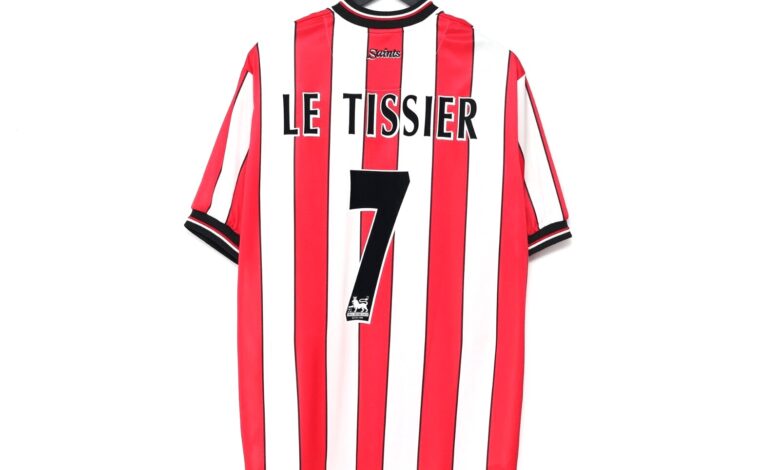
Particularly the home shirt from the 1993, 94 season encapsulates this moment very well; it is still clearly Southampton’s red and white stripes but with a design that shows great confidence and reflects the era’s inclination to complicate simple visual formulas.
The Dell’s Final Years and St Mary’s Arrival
Southampton’s relocation from The Dell to St Mary’s Stadium in 2001 was a significant change in the club’s history thus, their kit designs from that era can be seen as bookends of that change. The last few seasons at The Dell and the first ones at St Mary’s produced football kits that, through their details, reflect the change and thus supporters with long-term memories can pinpoint the kind of shirts they wore when the switch was made.
The Hummel era was marked by some striking changes in Southampton’s kit style in the closing years of the 20th century. The Danish manufacturer’s typical design sensibility was to bold graphic approaches, exact chevron details, and a certainty in leaving the usual way creating shirts that look instantly identifiable as Hummel products while at the same time carrying Southampton’s essential visual identity. These shirts have acquired a significant collector’s interest as Hummel’s football heritage has been more widely recognized.
The first season at St Mary’s kits coming from the Sainsbury’s TU clothing partnership stand out as one of football’s more unusual manufacturer collaborations. The tangible results were kits that put accessibility first over design ambition which led to the production of some clean and simple designs that have aged quite well, if not spectacularly.
Fans whose allegiance to the club was established during this time are likely to find these kits of great personal value and that is something that the collector’s market does not always take into account.
Supporters and collectors interested in the full range of shirts from this transitional period in Southampton’s history can explore options across different manufacturers and eras when looking at pieces connected to the Southampton team from these decades. The variety within a constrained time period demonstrates how significantly different manufacturers could shape the same club’s visual identity.
What Southampton’s Archive Reveals About Football Design
A look at Southampton’s complete kit history gives a great insight into how football shirt design actually evolves through the decades. The limitation of a strong visual identity, red and white stripes that must always be recognizable as Southampton, keeps designers working within boundaries that actually reveal their talents more clearly than total freedom would.
The best Southampton shirts of any era are those that have succeeded by working with the constraints rather than against them. They discover the specific stripe proportions, collar treatments, and additional details that are just right for their moment while still maintaining a strong visual connection with the past. The worst Southampton shirts of any period are those that have treated the constraints as problems rather than as the design brief itself.